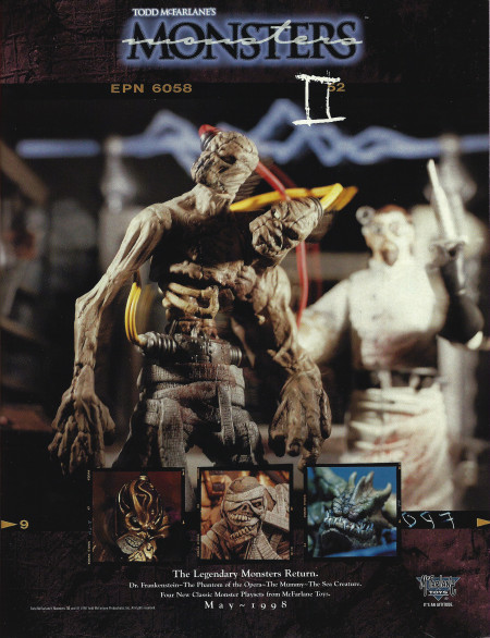
Todd McFarlane’s Monsters II Ad from 1998
From the June, 1998 issue of Lee’s Action Figure News & Toy Review (Amazon.com search*) we get to see McFarlane Toys take a huge leap forward in terms of graphic design. The 1996 McFarlane Toys promotion schedule that I posted yesterday was fairly flat and uninspired, but this ad for the Todd McFarlane’s Monsters II series (Amazon.com search*) looks incredible! That’s a huge step up from the 1996 page I shared yesterday.

Related articles
- “Who Needs A License Anyways?” (battlegrip.com)
- Unboxing Day: McFarlane’s 10″ Rick Grimes (dreadcentral.com)
There does seem like a point around the mid-90s that graphic design became important in the comics industry. I think it started in the indy comics scene, moved to Image and spread from there. Though I don’t know if Marvel and DC ever really caught on to it. They have always looked bland in that area, at least to me.
@Jason – Oooo. Now I’m going to look more closely at comic graphic design in the nineties.