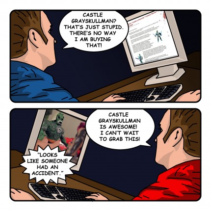
Castle Grayskullman: Presentation is Everything
When the Masters of the Universe Classics Castle Grayskullman was first revealed I noticed comments online where people were complaining about the design of the action figure. I personally think it was the coolest toy in the line that was revealed at San Diego Comic Con (and said so here), but it wasn’t until the creator of the design, Daniel Benedict, posted a video online showing just how damned cool Castle Grayskullman really is that I started seeing more and more positive comments about the design.
When I posted about the video earlier this week I commented on how this video, more than anything Mattel will do, is what will make Castle Grayskullman a star and a loved toy. And as I thought through that I realized that presentation really is everything. And that soon led to an idea for a very simple — and kinda dumb — comic. (And, to be honest, I just wanted an excuse to watch that Castle Grayskullman video again.)
Enjoy!

And now that I’ve created this one comic it makes me realize that I’ve got more ideas for comics. Maybe I should start my own webcomic about toys. Yeah, like I have time for that.
Related articles
- Does Matty Collector Need Kickstarter? (battlegrip.com)
- Masters of the Universe Classics Subscriptions and the Four Horsemen (battlegrip.com)
- Masters of the Universe Classics Series in “Danger?” (battlegrip.com)

I didn’t much care for CGM the first time I saw him. Unfortunately I just saw sketchy shots originally and I thought he was some kind of zombie figure. I actually wondered why he didn’t look like a castle, which should indicate how bad those shots were, lol.
Once I saw him full on, I liked him a bit better, but wasn’t sold on him. The commercial was hilarious though.
I think presentation is important in anything, to be perfectly honest. Mattel has put little if any effort in trying to endear fans to these new characters, so when someone does, it strikes a chord.
@Newt – The description alone sold me on this guy. And when I saw the pics I was sure I was going to love him. The look, concept, and even the name all scream “stupid fun!” and fits in wonderfully with the classic eighties line.
The commercial/video was great. I’d love to see more commercials like this; hell, I’d love to see Mattel produce an official commercial for the 2013 subscription.
And yeah, presentation is important to just about everything out there.
Just wish they hadn’t killed off Stratos.
Yeah, my only problem with the otherwise-hilarious commercial was the offkey violence.
@Stratos and Poe Ghostal – I thought the violence was stupid in a funny way. Excessive, yes, but so over the top to make the entire thing a little funnier for me.