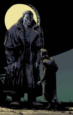
IDW Launching “The Ghoul” by Steve Niles and Bernie Wrightson

While the new IDW newsletter has more items listed than just this one, it’s got to be the new The Ghoul comic that really captures my imagination. I don’t buy many comics these days, but a new story from Steve Niles (website) and Bernie Wrightson (website) is enough to grab me. And, even better, it’s Niles writing about an investigator (I absolutely loved his three Cal MacDonald fiction efforts (Savage Membrane, Guns, Drugs, and Monsters, and Dial M For Monster), so seeing Niles return to this style of story makes me happy.
Wrightson handling the art? That’s just the icing.
“When Los Angeles Detective Lieutenant Lloyd Klimpt finds himself in the middle of a Hollywood mystery that falls way outside the norm, he knows he’s going to need a different kind of help than he’s used to. He finds it in the bizarre form of The Ghoul, a monstrous investigator with a reputation for solving the world’s weirdest crimes. Written and created by Steve Niles (30 Days of Night), with art by industry legend Bernie Wrightson.”
The three Cal MacDonald books sold out long ago, but there is Criminal Macabre: The Complete Cal McDonald Stories if you’re interested. Fun, wacky reads. Niles had a twisted sense of humor, and the noir-style he uses in these books almost makes them feel like they should be old B&W monster movies. Very much recommended if you’re a fan of reading monster stories.
I’m all for it if it’s not that horrible digital coloring over pencils without inks they have been doing with Wrightson’s work lately. He’s an old- school illustrator, and his work looks best when it has bold linework done by ink and brush. That City of Others series he did for Dark Horse was just his pencils digitally colored, and it was realllllly weak looking. I hope this one looks like his regular stuff! Wrightson is my favorite comic book artist… of all time! Steve Niles is the poo when it comes to horror… is there a horror series he hasn’t done?
@Monsterforge – Computer coloring can look great; it all depends on the colorist and what tools they use. Using scanned brush textures and watercolor paper, for example, can give you a very “painted” effect even though all of the work is done in Photoshop.
Back when I used to create covers I used a lot of scanned texture tricks combined with photos, painted elements, and found objects. Here’s one of the covers I put together a long time ago:
http://www.sjgames.com/gurps/books/in-nomine/img/cover_lg.jpg
I completely agree that it CAN look great. City of Others did NOT look great, though. Artists like Wrightson and Cary Nord have very sketchy, light, feathery pencils that are made to be completed with bold linework– digitally painting their stuff looks like someone took a bucket of watercolor paint and smothered the paper with it.
From the preview picture of The Ghoul that you posted, it looks like they at least are using digital inks before digital coloring, which is a key step in making work like Wrightson’s look great!
I really like the GURPS image you included. It is a beautiful image, but I don’t think that style would work for Wrightson’s pencil work.
I guess it comes down to whose work you are digitally painting. If it’s a penciller whose pencil linework is bolder and more defined, it lends itself more to the digital paint process. My main point of contention is that Wrightson’s pencil work is anything but.
@Monsterforge – In an ideal world, Wrightson’s art would be in B&W. Like his old Frankenstein book.
http://www.frankensteinillustrated.com/
A-flippin-MEN.