Illustrating Powerglide
One of the things I’ve been doing lately to keep myself entertained is creating simple, rough digital illustrations. I’ve had a few favorable comments about the work, and a few questions about the process, so here’s a quick step-by-step to give all of you some ideas on how to turn your photographs into digital illustrations.
Step One: Start with a Photograph
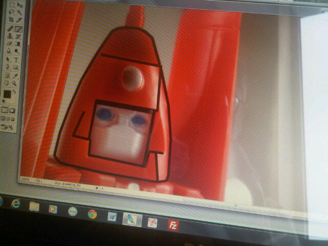
The first step to using this digital illustration process is to snap a photo of your subject. For this example I shot a new picture of the unofficial Transformers Glider (review here) and then imported the image into Photoshop. You’ll need a program with layers to take advantage of this process, but the completely free GIMP (website) uses layers and I’ve used the program to make some of the illustrations I’ve posted here in the past.

Step Two: Outline the Shapes
On a layer, using a brush and black color, outline all of the hard, basic shapes of your subject. The image above shows the illustration in progress with the beginning of some shapes outlined. This is basically digital tracing and you can use this step to eliminate screws and nasty seams from the image . . . by just not tracing the elements you want to lose. This step will take longer than any other so pop in some music and have fun.

Step Three: Fill With Color
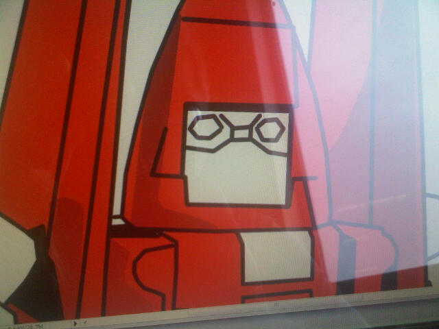
I always select and fill each area separately, using the expand option to expand my selection. The color layers are all below the line layer in my work; this keeps the black lines sharp. By expanding the color two pixels you run under the black which avoids any nasty white pixels here and there. This basic color fill should be the primary, dominate color for each shape.

Step Four: Create Highlights and Shadows
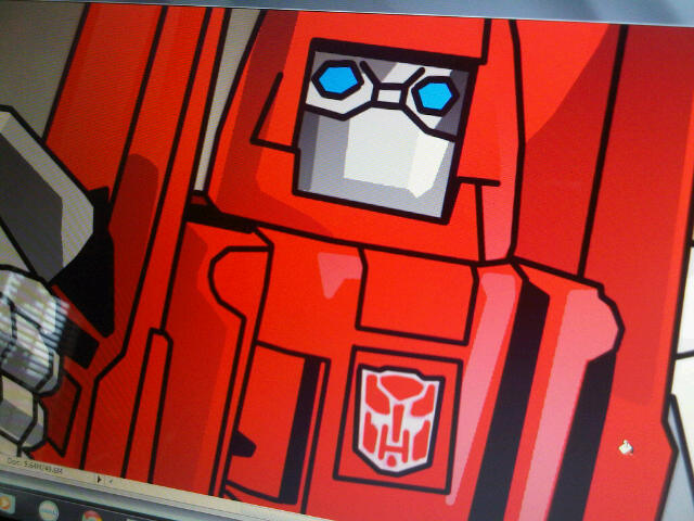
By using the method of tracing and darker and lighter shades of your base colors you can form shadow and highlight spots over the basic shapes. This adds a lot of depth to the illustration and may be the most important step of the entire process. I usually stick to one or two highlight and shadow colors to keep the sharp, stark appearance but if you want more depth just use more colors. This can sometimes take as long as the tracing step depending on how many details you want to add.

Step Five: Background and Done
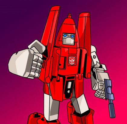
You can skip this step entirely — I often do — but sometimes a simple gradient of even solid fill behind the image helps it to pop. To completely separate the illustration from the photo I drop in a white layer between my work and the photo and doing that early will help you see the image more clearly; just turn the white layer off and on while you work to keep an idea of how your illustration is turning out.

Have Fun!
And that’s my very rough guide to how I’ve been creating digital illustrations. To keep the style I’ve been working on simple I use all lines — I point, click, and then hold SHIFT as I click on the next point to draw a straight line between points — but there’s nothing stopping you from using curves or any other line you wish. The end result may look like a vector image but it’s all pixels; I’ve just never enjoyed vector programs and Illustrator makes my head hurt.
I hope you found this useful, and if you create an image of your own please let me know because I’d love to see what you come up with.

Cool! I’ve always thought these illustrations were cool, and I’ve been wondering how you’ve been doing them. I also didn’t even know about the expand option for selections. I think that will save a lot of time for my stuff. Thanks! 🙂
@Nathan – Yeah, there’s actually not much of a secret behind these. I learned that expand trick way back in the late 90s when I used to spend a lot of time coloring art. I’m thinking I may post a followup to this one showing more detailed screenshots of what I’m talking about with layers, selection, and point-to-point lines. Glad to hear you found some use in this.