Review – Batman “The Caped Crusader” Mini-Bust

Another score from my recent visit to the Austin Books clearance store, this Batman Mini-Bust* from 2004 brings me a step closer to the classic-styled Batman I’ve been looking for, but he’s only half a Batman and a bit too simplistic to really fill that hole in my collection. But enough about my collection; it’s time to take a close look at this statue.
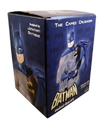
Packaging
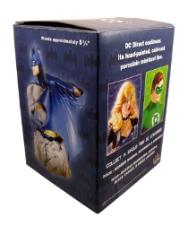
Absolutely no artistry at all went into the design of the box; it’s got simple type and photos and about the only real work went into the tiled bat emblem that’s screened in the background. A very, very dull box and one I’m tempted to toss. But I likely won’t if only because the box does a good job of protecting the statue whenever it’s time to move. Still, a very sad start for this Batman mini-bust.
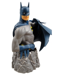
Sculpt
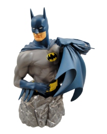
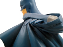
Artist Jonathan Matthews is credited with sculpting this Batman and he did an excellent job of translating the classic “Caped Crusader” blue and gray Batman to micro-statue form. Smooth, clean lines and chiseled facial features all come together to remind me of that Batman of my younger years. It’s not exactly the Ten Nights of the Beast* Batman, but it’s very close. And those blank, featureless eyes are as much a part of the design and the symbol on the chest and both are well-executed on this statue.
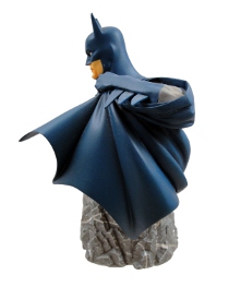
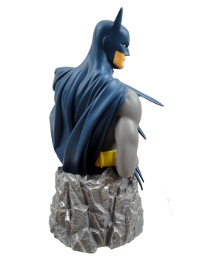
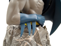
My only complaint with the statue’s sculpt is the base; what in the hell was the idea behind the rocky base? And why is it covered with silver-colored lines? I would have much rather seen a city skyline or cloud of bats used as the base instead of the rocky, unusual design. I guess what we have here isn’t distracting, but it also isn’t very interesting.
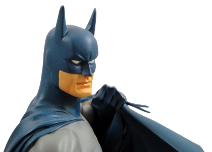
Paint
Clean and uninspired sounds about right. All of the colors are right, and the paint work is tight, but there’s only six or so colors used and nothing was done to bring out the details of the sculpt. I suppose I could step back and say the paint is well-suited to the source material, but I would have liked to have seen some faint highlights and shadows painted into the statue to help pull out the sculpt. It’s unarguably appropriate paint for the subject and the seventies/eighties Batman costume, but I would have liked to have seen a little more work put into the paint.
In the right lighting the sculpt does an adequate job of casting shadows along the chest and under the raised cape, but the statue would have been significantly improved if they had used just one more shade of blue and one more shade of gray to provide subtle color layers.
Nice, But Not Perfect
In the end this 5 3/4-inch tall mini-bust is a nice work but it’s not the classic Batman that will make me stop my search for a “Caped Crusader” for my collection. This Batman Mini-Bust* is too small and the paint too simplistic for me to shout out that it is great, but I do have to say the sculpt does an excellent job of bringing the classic Batman to the third dimension. It’s like it was pulled straight from a comic panel.
I’m glad I snagged this at a heavy discount, and I will display it (where I hope lighting will help), but I don’t recommend that anyone rush out and search for this older mini-bust. It’s just okay, and not worth spending a lot of time or money tracking one down.
Philip Reed needs to avoid that Austin Books clearance store, because they have a Batman: Vampire Statue* that looked really cool. Expensive, but cool.
