Review – Cthulhu Juice Crew Ducksauce
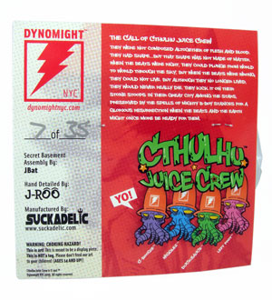
“They were not composed altogether of flesh and blood. They had shape…but that shape was not made of matter. When the beats were right, they could plunge from world to world through the sky; but when the beats were wrong, they could not live. But although they no longer lived, they would never really die. They kick it on their stone stoops in their great city among the stars, preserved by the spells of mighty b-boy stances for a glorious resurrection when the beats and the earth might once more be ready for them.”
— from the back of the card
Ever since Ducksauce was first teased I’ve been following the progress (here’s my first post about the figure) and have loved what I’ve seen. A cooperative project between The Sucklord and Dynomight NYC, Ducksauce has to be the best bootleg resin action figure I’ve ever seen. The design is cool, the paint is phenomenal, and everything just came together perfectly.
Packaging
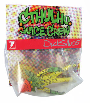
Here’s another bag + header card design, which is unfortunate since I was expecting the usual Sucklord-style backer card and blister design (take a look at this review to see what I mean). What we got isn’t bad — as you all know, bag and header card is very standard for indie/designer toys — but it’s not nearly as cool as a card and blister would have been.
This is an improvement over the usual bag and header design, though, since the card is much larger than most and the design’s clean and legible. The warnings are minimal — “Please don’t feed our art to your children.” is my favorite part — and not quite as insane as what we’ve seen on the Secret Cinnamon Squad’s toys.
Ducksauce = Awesome Inanimate Object
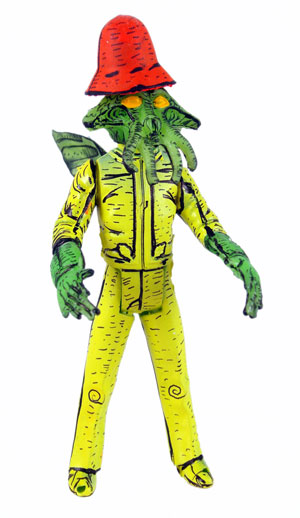
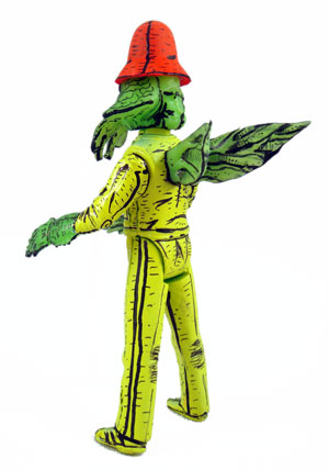
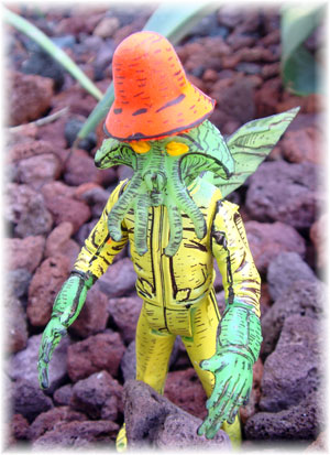
Check it out, folks. Take one Star Wars Squid Head, a Watto, an Admiral Ackbar, some sculpey (I guess), and I don’t know what else and blend it all together and you’ll get Ducksauce. The hat’s a great touch — it sits a little too high on the head, but it looks good — and the semi-translucent green hands, head, and wings look great.
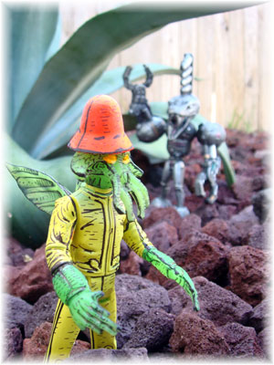
My Ducksauce cannot stand on his own. He’s got the usual holes in his feet so he should work with a stand, but there’s just no way in hell this guy’s gonna do anything but topple over on his face if you leave him alone. Just taking these photos was a little risky since the tacky stuff I used on his feet didn’t always hold perfectly and he took a few spills. Nothing broke, though, so no harm done. I need to think about the best way to display him but I’m thinking probably posed on a vehicle or playset.
Paint!
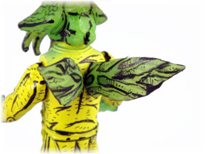
The paint, especially all of the black detail work, is what really takes this from a neat bootleg to the best bootleg resin action figure that I own. The amount of time the detailing had to have taken more than justifies the figure’s $35 price tag; take a look at the photo below for a close shot of the wings. There’s as much detail drawn on the figure as there would be in a drawing on paper . . . and there were 35 of these guys created! That’s a hell of a lot of line work for one guy to produce; no wonder these guys came out a few weeks later than originally planned. The delay was worth it!
I wish this guy would move . . .
The only thing that would really improve Ducksauce would be the addition of a few points of articulation. Even just pegs connecting the arms would drastically improve the figure, since then I could pose him with his arms down, up, whatever I wanted to do. And it wouldn’t be all that tough; I’m tempted to go at this guy with the Dremmel and add in the necessary pegs at the shoulders. After all, I’ve already “ruined” the art by opening the pack.
Hey, Free Art!
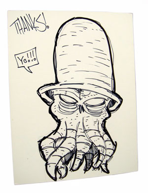
Packed inside the box was an original sketch of Ducksauce (shown below). This was an unexpected surprise and I’m gonna display this sketch right alongside the action figure. I love when artists throw in a sketch or art card since it’s just a tiny bit extra that looks great on the toy shelf. I should take some photos of my displayed toys to show what I mean by mixing the artwork with the figures.
Closing Thoughts
Isn’t it amazing how my perception of resin toys changed as I collected more of the pieces? Just seeing photos and talking to people about the idea of resin toys — especially resin “bootleg” toys — doesn’t even come close to the experience of actually holding these pieces and playing with them. I’m glad that I found out just how neat these were before Ducksauce was released, since I knew to snatch this guy up the instant he was uploaded for sale.
Ducksauce is sold out now, but if you like what you see here then I recommend keeping an eye open for the next Cthulhu Juice Crew action figure. I’ll no doubt post teaser images here at battlegrip.com as they’re released, so don’t worry too much about missing the next one.
The Sucklord and the guys at Dynomight NYC did a great job and should be proud of this figure. They’ve produced a weird, fantastic-looking chunk of resin that is going to look great right beside my G.I. Joe and Star Wars action figures. 3.75-inch is the best scale and I love that most of these bootleg toys are designed for this scale.
Philip Reed can’t wait to see the next collaboration between Dynomight and Suckadelic. Ducksauce is awesome and the combo can only get better with practice.

Great review on an awesome resin inaction figure. I too love my ducksauce’s I used starwars/gi joe figure stands for mine and it works great. I like to put drawings with the items I get too. Which isn’t to many but I love the 2 I got. I will put in top loaders for display. I love the last pic and who is lurking in the background :).
Man… that guy rules… but I’m looking forward to your figure MUCH more.
I love the way he looks, but I was hoping that he would have had at least hips, if not hips and shoulders. Oh well, still a great looking guy and I love that paint job (it reminds me a bit of the NECA TMNT).
I couldn’t get past the paint job – didn’t look like it would fit with the other Sucklord creations.