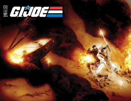
Spotted Online – Ben Templesmith’s Cover for G.I. Joe
Comic artist Ben Templesmith creates artwork that I either love or hate. I cannot think of any other artist who creates work that I have such conflicted feelings about.
Well, Templesmith has gone and created a piece that I really do not care for. For IDW’s G.I. Joe series we get this new image:

That just doesn’t work for me. It’s too sketchy, and Storm Shadow has something really weird going on with his anatomy.
And it’s not that I have a complaint with mixing this style of art and G.I. Joe. In my (detailed) post about the recently-released G.I. Joe vs. Cobra, The Essential Guide I was very happy to find Ashley Wood’s G.I. Joe covers printed as full-page images.

No. The problem with the new Templesmith art, in my opinion, is that it looks rushed and just doesn’t grab me.
So you spent an entire post showing us a cool image just to tell us you think it’s shit? Haaaaaah!
Funny guy. I think that image is stunning. Ashley Woods work always looks rushed and is far too sketchy. If you want quality art Templesmith wins every time.
@Rob Hackney – “So you spent an entire post showing us a cool image just to tell us you think it’s shit? Haaaaaah!”
I posted the image because I knew some of the guys following this site wouldn’t likely see it otherwise; since battlegrip.com covers toys — and related stuff — from different areas of the toy industry I’ve discovered that not everyone following the site sees everything I see.
And this style of art is as subjective and emotional as you can get in my opinion. Where you feel Templesmith is the better artist I feel Wood is better. But it’s all opinion and, in the end, my opinion doesn’t mean any more than yours.
And I do like some of Templesmith’s work, just not all of it. I feel the same way about Ashley Wood’s work but, in general, I like Ash’s work more often than I do Ben’s.