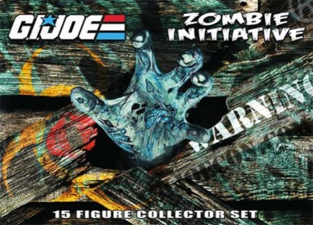
The G.I. Joe Zombie Box Art Isn’t Great
The box artwork for the convention exclusive G.I. Joe zombies art has been revealed (shown at Toy News International) and it really isn’t all that hot. I had thought the entire Zombie Hunters concept (first mentioned here) was a great idea, but it is unfortunate that Hasbro and the G.I. Joe convention didn’t sink more effort into the set to create some amazing box art.

I’ve complained before — sometimes unfairly — about how toy companies don’t put the resources into artwork that they once did, but I think this time around I’m totally justified when I say that this box art should have been far, far cooler than it is. Hell, a series of comic panels telling a story — or even just a comic cover design approach — would have been a lot more engaging and fun than this image.
It’s too bad toy sales have fallen so far.
Related articles
- Remember, Only G.I. Joe is G.I. Joe (battlegrip.com)
- Fifty Years of G.I. Joe!!! (battlegrip.com)
- Uncommon Cold with G.I. Joe (battlegrip.com)

Too bad they did not go with a similar style as the recent GI Joe SDCC exclusives. I know I love the box art on those and my impression is that most people do.
This looks like something I drew in the margins of my notes in high school.